
 Selected work
Oak AI / RESEARCH TO DESIGN · PRODUCT CLARITY
Turn a UX audit into decisions people can see.
Connecting inconsistent navigation and unclear feedback to concrete design recommendations for an early AI product.
5 min read
- The task
- Understand what the product offers, choose the right starting point, and recover when account access fails.
- My contribution
- Desktop heuristic evaluation, navigation alternatives, visual recommendations, and research-to-design collaboration.
- Where it landed
- A November 2023 evaluation followed by team recommendations, two navigation sitemaps, and later usability work. These artifacts do not establish measured product improvements.
01 / Original evidence / design decision
Separate the choices people are being asked to make.
The entry points mixed training an assistant, starting a Vibecheck, and requesting support. I documented the competing labels and visual treatments, then used the audit to argue for a more coherent navigation structure. The first design decision was to make those choices explicit.
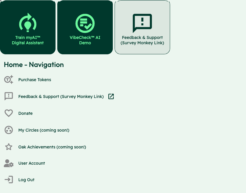
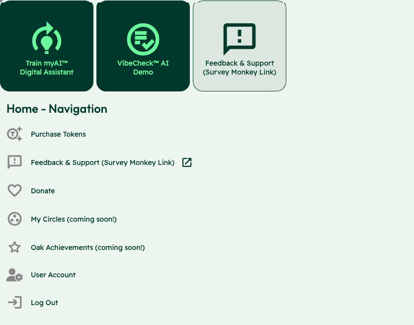
I connected each evaluation finding to the decision someone was trying to make, so the team could discuss the problem rather than a preference for one layout.
Decision notes and evidence
Alternatives and constraints
- Alternatives
- I audited the existing navigation labels, compared their advantages and disadvantages, and developed two sitemaps to evaluate different structures. The contribution log records a clearer training entry, a universal header and footer, and more descriptive calls to action as part of that work.
- Constraints and tradeoffs
- A clearer label alone would not settle the structure. The report also recommended conventional placement for the logo, navigation, and utility links, with the logo consistently returning home. Naming and location needed to reinforce the same route through the product.
Evidence behind this account
The original report and contribution log establish the findings and the alternatives. Card sorting and formal A/B comparison of sitemaps were proposed future research; these sources do not show a winning sitemap being tested and selected.
02 / Original evidence / design decision
Put the error beside the field.
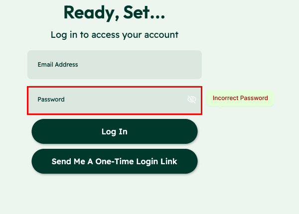
The original error appeared in a small banner at the bottom of the screen. The proposed treatment moved feedback beside the password field, with a red outline and an Incorrect Password label. It made the point of correction clearer; fuller recovery guidance was still needed.
Observed interface
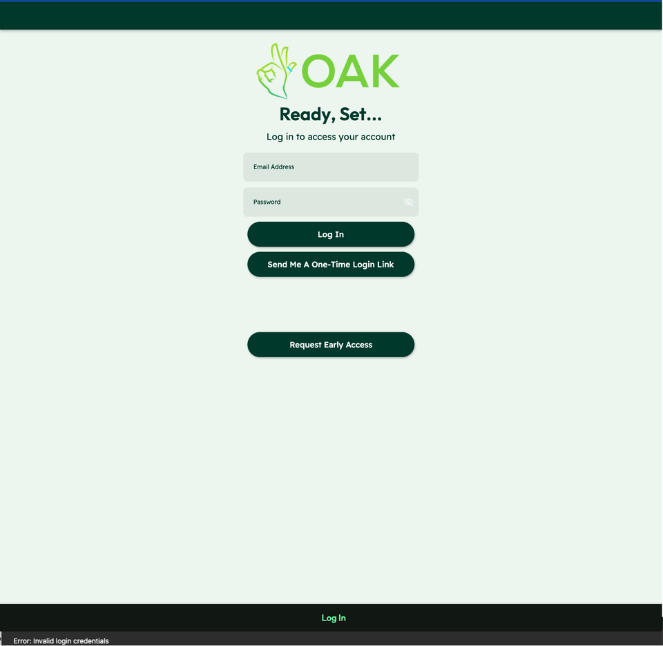
01 / The message at the foot of the page

“Error: Invalid login credentials” appears below the form. It names the failure without connecting it to a field or explaining the next step.
Proposed feedback
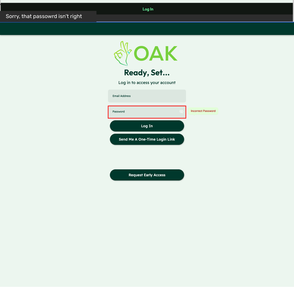
02 / The message beside the password
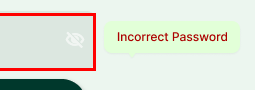
The proposal adds “Incorrect Password” beside the field and shows an alert above the form. The field is identified; fuller recovery guidance remains a next step.
Two crops from the original Oak recommendation, 2023. The right-hand view is proposed feedback.
View the full original recommendation
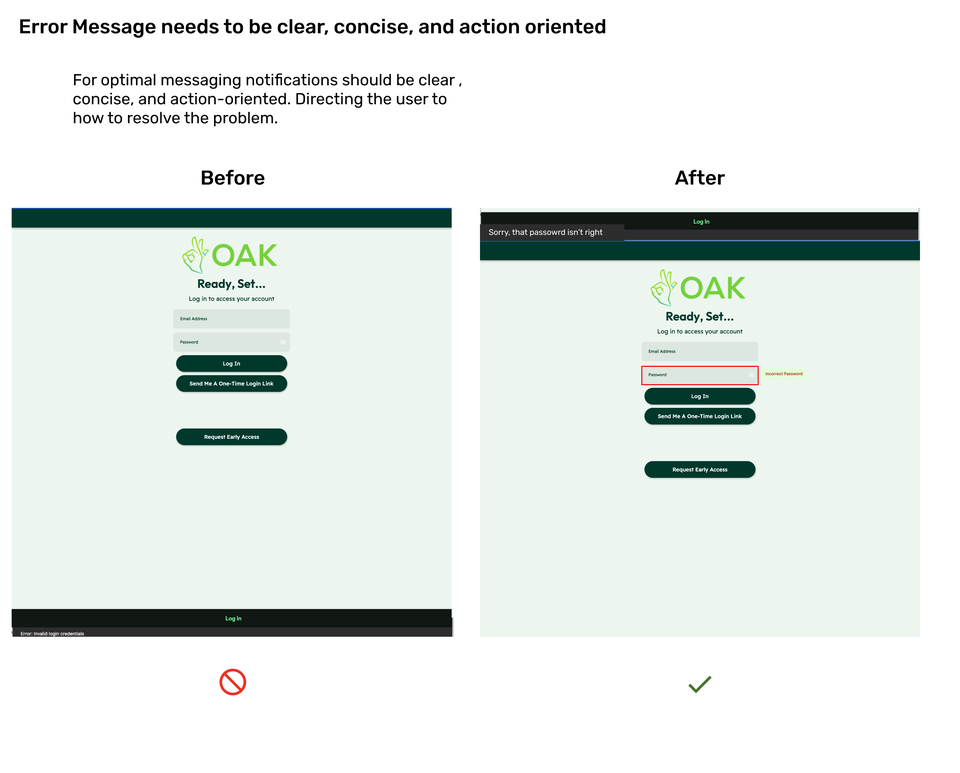

Put understandable feedback beside the affected field. The recommendation makes the correction easier to locate; additional guidance would still need review.
Decision notes and evidence
Alternatives and constraints
- Alternatives
- The recommendation paired the original screen with a red outline around the password field and an Incorrect Password label. It also showed an alert above the form. The one-time login-link action remained available, while the field-level message made the proposed association explicit.
- Constraints and tradeoffs
- Moving the message beside the field made the error more specific, but the label still stopped at naming the problem. Looking back, I would develop the recovery copy further and check how the password and one-time-link routes should work together.
Evidence behind this account
The original comparison makes the proposed change visible. The sources do not establish a measured drop in login abandonment or show that the exact pictured treatment was released.
03 / Original evidence / design decision
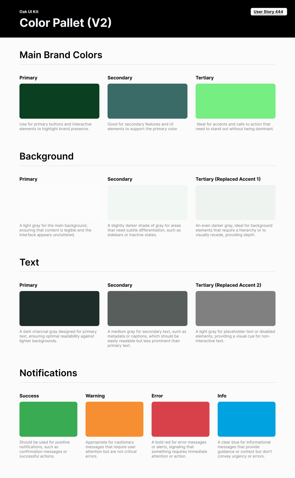
Give the next iteration a shared visual language.
The color guidance assigns different jobs to brand, background, text, and feedback colors. I documented those roles so the next iteration could use a consistent visual language rather than make each screen’s choices independently.
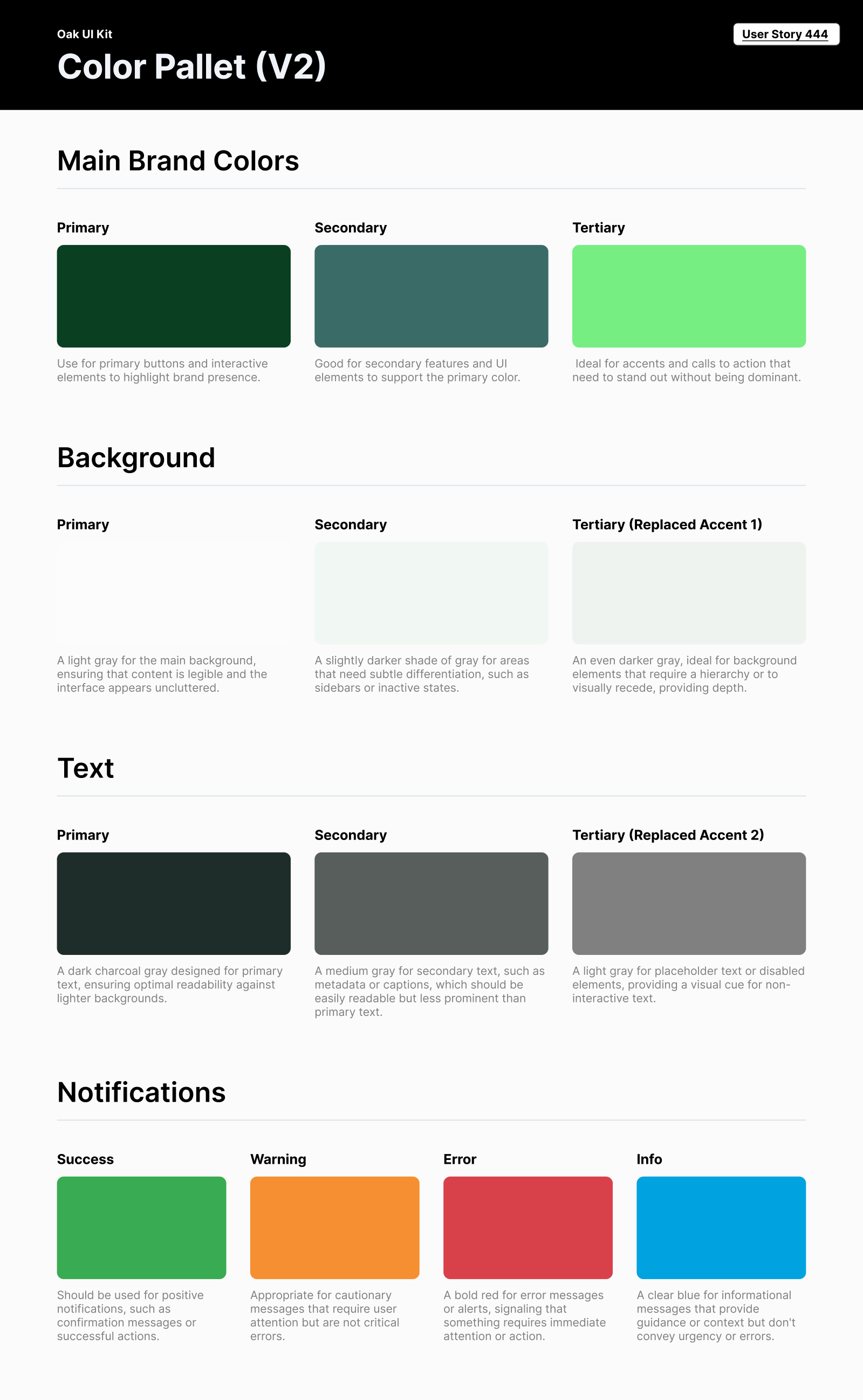
Color roles give designers and engineers a common basis for later screens, rather than renegotiating every visual choice.
Decision notes and evidence
Alternatives and constraints
- Alternatives
- The guide separated brand emphasis from feedback: success, warning, error, and informational messages each had a stated purpose. It also gave primary, secondary, and tertiary roles to background and text colors.
- Constraints and tradeoffs
- This was a focused specification for the next iteration. A palette with named roles could support consistent decisions, but the artifact alone did not establish a complete component library or verify color contrast across the product.
Evidence behind this account
The original one-page Oak UI Kit V2 export is tied to User Story 444 and documents color roles. It establishes a focused design guide, with component coverage and color-contrast validation still to be established.
WHERE IT LANDED
A product direction the team could review.
I turned the audit into visual alternatives for navigation and login feedback, with shared color guidance. Each recommendation connected an identified problem to a specific change and the reason for making it.
What I learned and would test next
Research becomes easier to act on when people can see the decision it changes. For me, the useful handoff is the problem beside the proposed behavior, with enough reasoning for the team to challenge the choice.
I would validate whether first-time users can choose a starting point, understand the product’s value, and recover from login errors without assistance.
Original heuristic evaluation and design recommendation exports. Screens show proposed changes; implementation and outcome measurement are unverified.
KEEP EXPLORING