
 Selected work
FactorLab · SmartTagIt / CONVERSATIONAL AI · MOBILE + WEB
Give an AI conversation a way forward.
Designing Flint’s first question, waiting states, and recovery so the conversation holds together when a response stalls or the connection drops.
6 min read
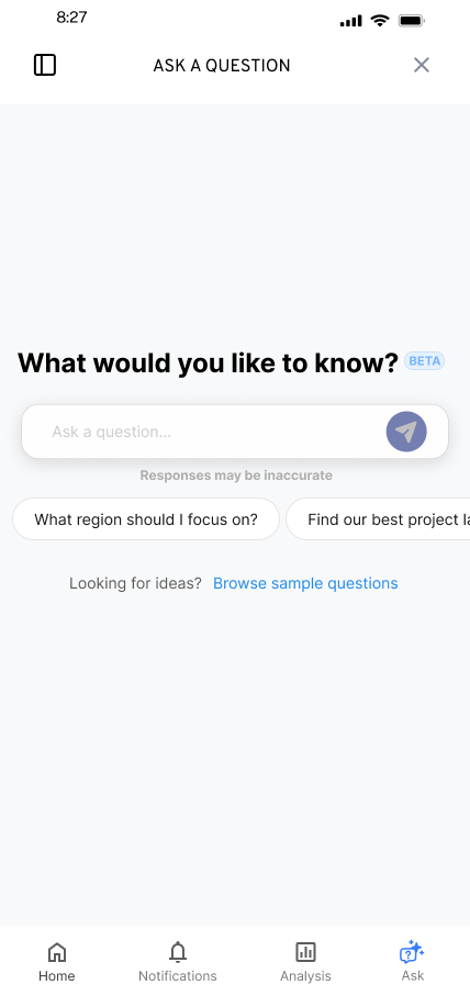
- The task
- Ask a question about safety activity, inspect the answer, and keep going when the response is interrupted.
- My contribution
- Mobile and desktop conversation flows, question entry, saved questions, recovery messages, and annotated Figma handoff.
- Where it landed
- Annotated mobile and desktop handoff. Engineering reported Ask a Question error states implemented to approved Figma in August 2026.
01 / Original evidence / design decision
Make the first question easier to ask.
An empty conversation asks people to work out both what to ask and how to begin. I explored suggested questions and a question library as starting points, while keeping space for people to ask their own question.
Before · category-led entry
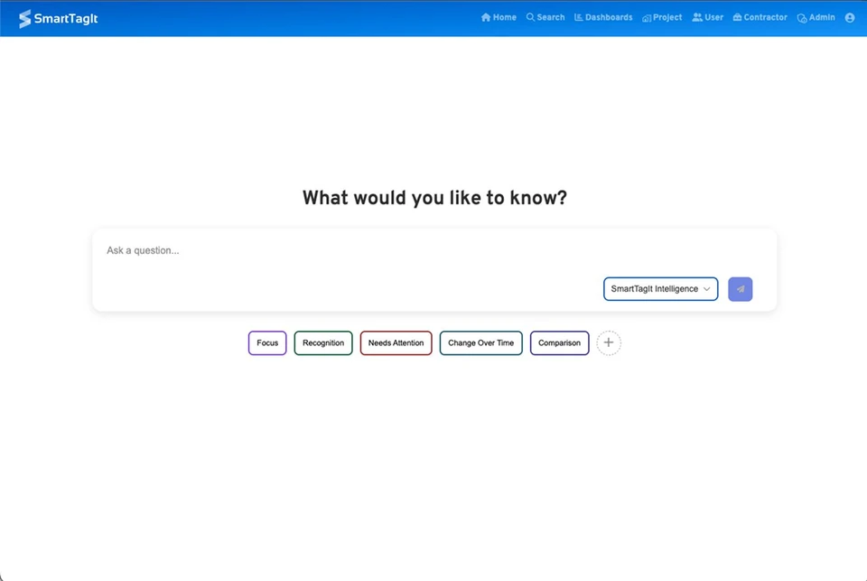
Closer look · broad categories
The earlier screen paired an empty field with broad categories. People still had to work out a useful question before they could begin.
Inspect this screen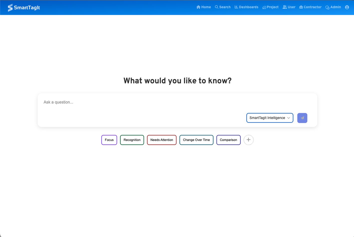
After · my design exploration
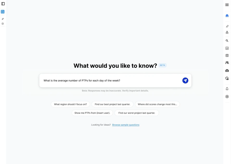
Closer look · a question someone can use
I made specific questions visible and let a suggestion fill the input for review or editing. A separate library offered more examples without filling the first screen.
Inspect this screen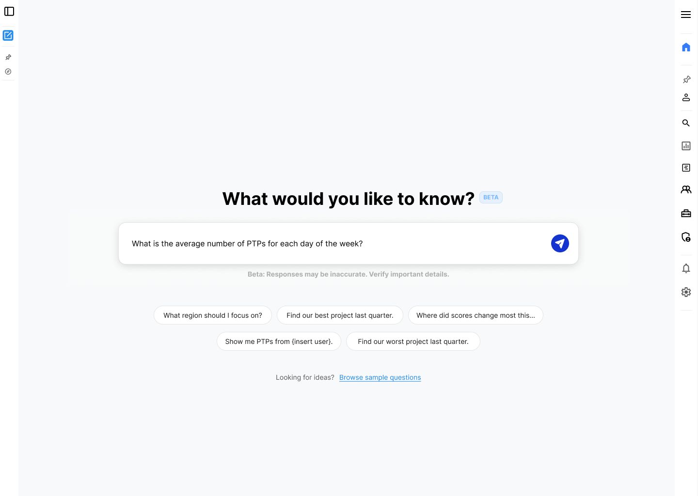
Original before and redesign screens from my FactorLab portfolio. The redesigned screen is a design exploration with sample content. This comparison shows the entry decision; it does not establish a measured usability gain or the released navigation layout.
See the companion mobile design
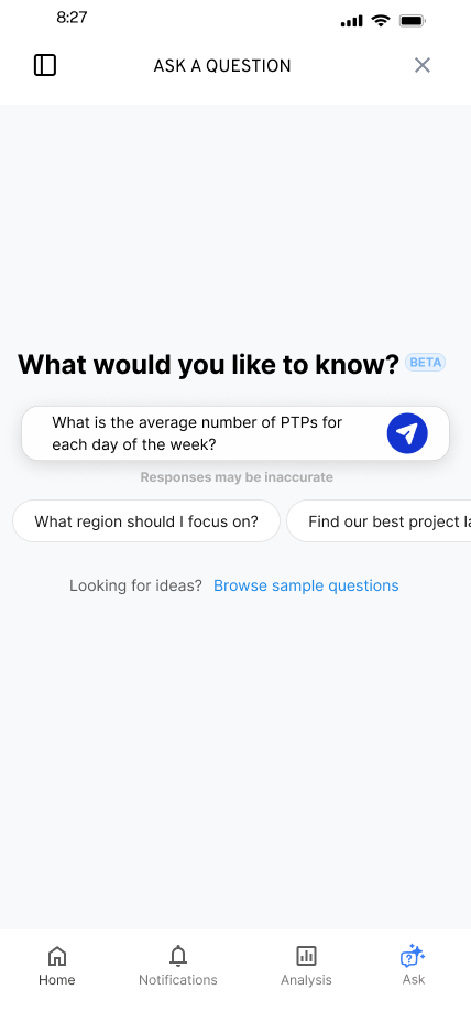
Specific examples give people a starting point they can recognize and edit, while keeping their own question possible.
Decision notes and evidence
Alternatives and constraints
- Alternatives
- I explored different treatments for the suggestions, access to a larger question library, and access to pinned questions. The library was a separate flow, so the first screen did not need to carry every possible question.
- Constraints and tradeoffs
- The same question can depend on earlier context. In the pinned-question flow, I explored asking whether to include the previous conversation context, with an alternative that let people edit the question to supply the context they wanted. That choice was still optional in the design review.
Evidence behind this account
Original entry and pinned-question screens, plus walkthroughs 1, 2, and 4, establish the proposed interactions. They do not establish which approach users preferred or how conversation context was implemented.
02 / Original evidence / design decision
Give waiting a visible state.
While Flint prepared an answer, the interface needed to show that the request was in progress. I explored that state within the conversation and worked through animation constraints with the product lead.
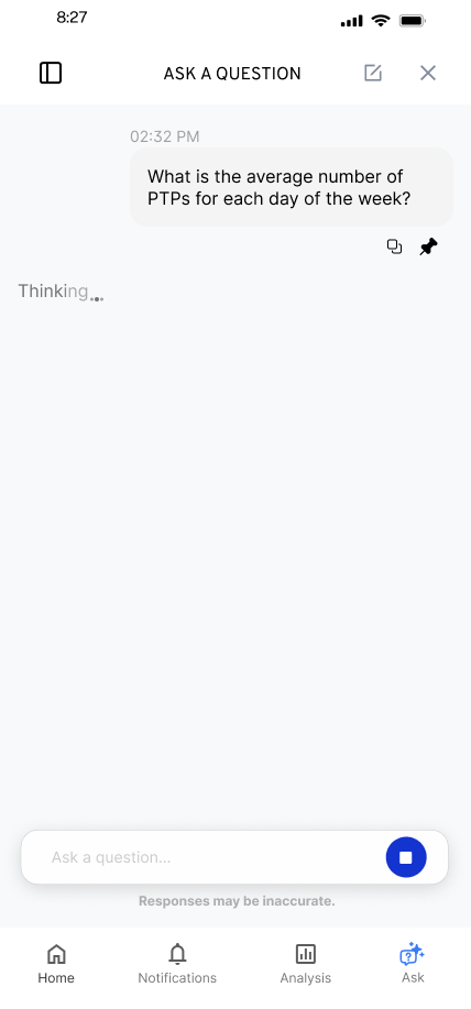
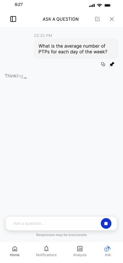
Keep the question visible while the response is being prepared. I worked through the feedback treatment and animation constraints with the product lead.
Decision notes and evidence
Alternatives and constraints
- Alternatives
- The walkthrough describes animation between states, with the exact treatment dependent on technical constraints. The still screens document those visual options; they are not evidence that the interface could report a particular stage of the underlying AI process.
- Constraints and tradeoffs
- Keeping the answer layout familiar focused the iteration on what happens before and around the answer. The final animation and timing needed to be worked through with engineering.
Evidence behind this account
The archive supports the loading-state designs and the technical constraint. It contains no measured response-time study or observed comparison of waiting treatments.
03 / Original evidence / design decision
Match the recovery to what actually happened.
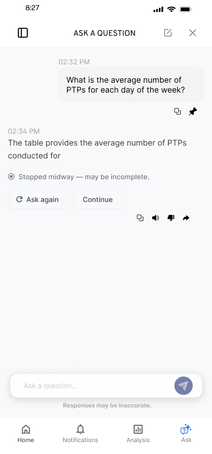
A lost connection, an answer that never starts, and an answer that stops midway are different situations. I designed distinct messages and actions: retry a saved question, ask again, or continue an incomplete response. The next action follows the state of the conversation.
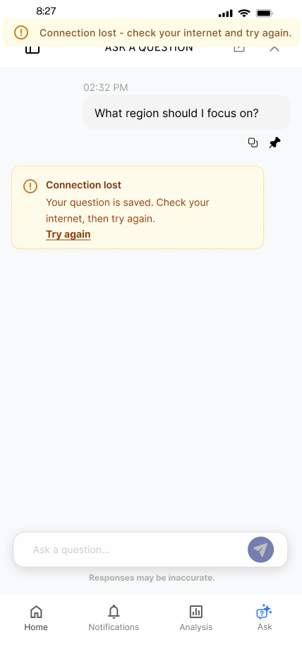
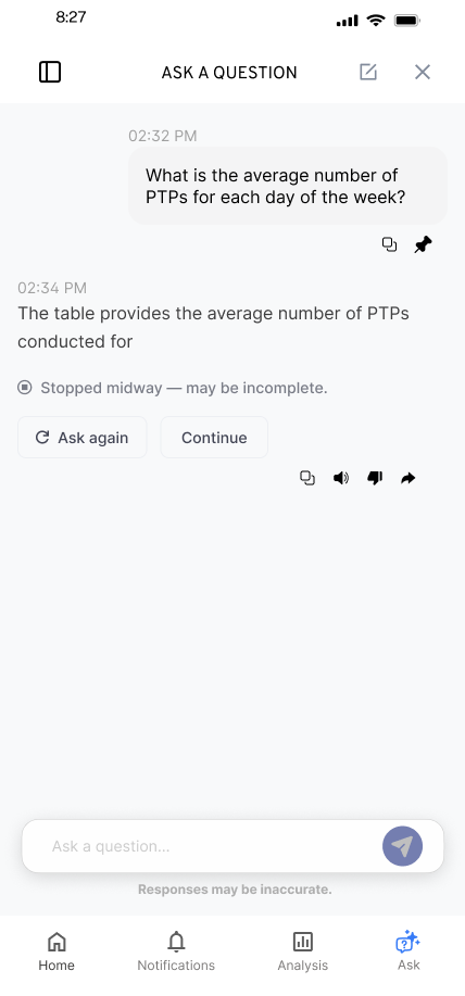
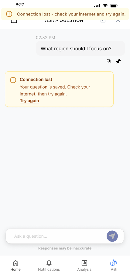
A partial answer and a lost connection need different next actions. I preserved the question and made the recovery choice explicit in the handoff.
Decision notes and evidence
Alternatives and constraints
- Alternatives
- Retry the saved question after a connection loss; ask again when a response has not completed; or offer Ask Again and Continue when a partial answer may be incomplete. The walkthrough also covers opening the question area while already offline.
- Constraints and tradeoffs
- Recovery could not stop at the first failure message. I specified that retrying while still offline should produce a banner. Submitting a newly typed question was another route out of the connection-loss message. The design therefore had to cover the next attempted action as well as the original failure.
Evidence behind this account
The March 27 walkthrough explains the messages, actions, and Figma location for engineering. An August 3 reply reports the approved Ask a Question error states implemented. That report does not independently verify client-side persistence, restored connectivity, or the exact released behavior of Continue.
| Situation | Design response | Work stage |
|---|---|---|
| Connection lost after asking | Tell the person the question is saved and offer Try Again. | Proposed recovery behavior |
| Try Again while still offline | Show a banner so the retry does not appear to do nothing. | Specified follow-on state |
| Response stops before completion | Offer Ask Again. | Design variant |
| A partial answer is visible | Make incompleteness explicit; offer Ask Again or Continue. | Design variant |
| Question area opened while offline | Explain the connection problem before a question is submitted. | Separate initial state |
WHERE IT LANDED
A handoff the team could implement and question.
I connected the entry, waiting, saved-question and recovery flows in an annotated handoff. In August 2026, engineering reported that Ask a Question’s error states followed the approved designs. The team also identified AI Assist’s older patterns as a separate consistency decision.
What I learned and would test next
The most consequential interaction decisions often happen when the system cannot give people what they expected. Working through those states early helped me make the product’s behavior clear enough to discuss with the team.
I would test whether people can distinguish an incomplete answer from a failed request, then track whether they recover successfully or repeat a question unnecessarily.
Original Figma exports, project walkthroughs, the March 27, 2026 recovery handoff, and April/August engineering correspondence. Screens show original interface and design variants with sample content. Error-state implementation is engineer-reported; individual variant behavior and user outcomes have not been independently verified.
KEEP EXPLORING