
 Selected work
FactorLab · SmartTagIt / INFORMATION DESIGN · AI FEEDBACK
Make feedback useful before making it a score.
Turning a broad personal-dashboard concept into a feasible first release, with clearer summaries, useful detail, and negotiated scope.
5 min read
- The task
- Understand my recent safety conversations, inspect a comparison, and follow a useful recommendation.
- My contribution
- Page hierarchy, widget and interaction alternatives, research-informed decisions, and design-to-engineering refinement.
- Where it landed
- A team-reported web and mobile release in September 2026. The images show design iterations rather than a production walkthrough.
01 / Earlier experience / broader concept
From repeated cards to a connected overview.
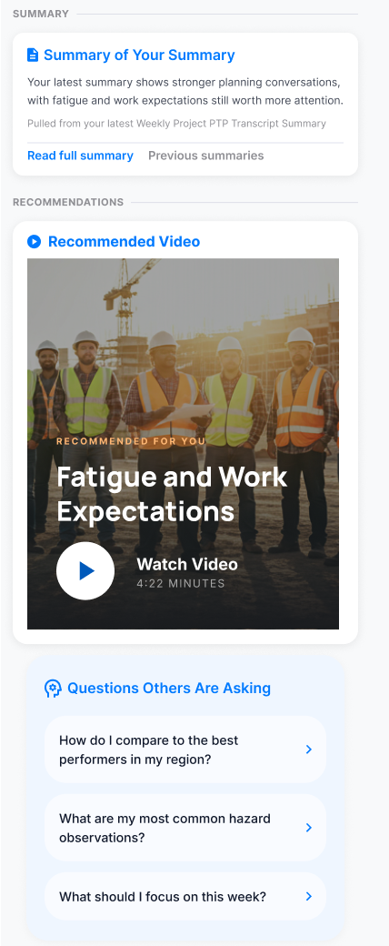
The earlier page repeated comparison cards. My broader concept connected a personal summary, recommendations, and questions so the page could suggest a useful next step.
Earlier comparison cards
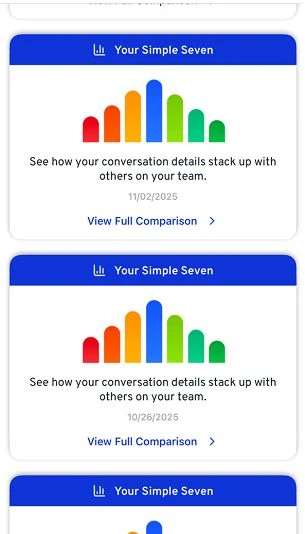
Original 305px-wide source, kept at its native scale.
Inspect screen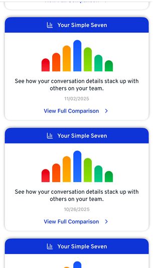
My broader concept
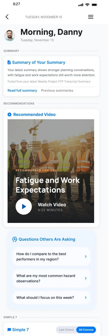
An early design direction with sample content, not a screenshot of the final release.
Inspect screen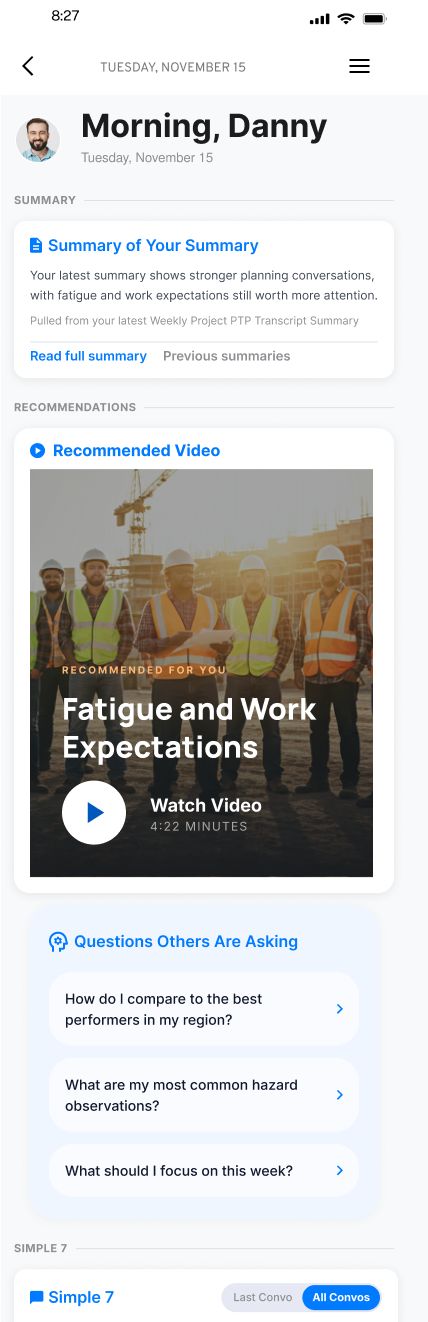
The direction puts useful next actions beside the summary. People should not have to translate a score into a task on their own.
02 / Scope and collaboration
Agree on first-release priorities.
With product, I prioritized summaries, recommendations, the existing scoring view, comparisons, and accomplishments. The exploration below helped us discuss that direction; customization remained a separate scope decision.
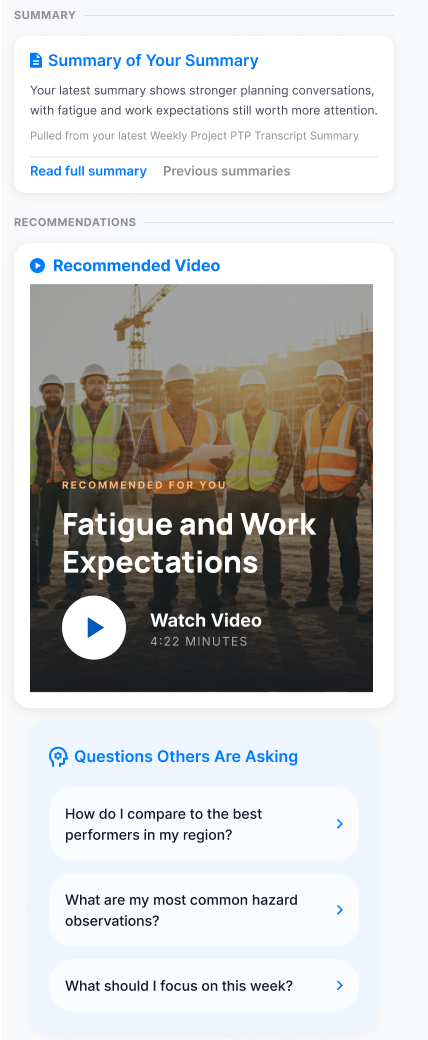
Start with a useful summary, then let someone inspect the detail when they need it. I worked with the team to preserve that path within a feasible first release.
Decision notes and evidence
What we kept, changed, and deferred
| Decision | Design choice | Reason |
|---|---|---|
| Keep | Existing summary history, video playback, and answer routes | Build on capabilities people already had. |
| Change | Shorter summaries, clearer recommendations, and explicit paths into detail | Make the first view useful without hiding the supporting information. |
| Defer | The proposed people-you-follow link | Product kept that feature outside the immediate scope. |
Summary of the design and scope decisions. Personal widget customization remained an exploration.
Alternatives and constraints
- Alternatives
- I explored dense, simple, and milestone-focused versions, plus adding, removing, and reordering widgets. Another specific choice was whether recommended questions should have equal emphasis or one primary suggestion with quieter alternatives below it.
- Constraints and tradeoffs
- The product discussion favored more reusable modules so different activity measures and facts would not need a separate card design each time. At the same time, a cleaner presentation could not discard the detail people already had: Simple 7 bars still needed to lead to an explanation and recommended video.
Evidence behind this account
The April–May walkthroughs show the explored directions. The later team discussion supports the modularity and transition requirements. These sources do not prove that personal reordering, all density variants, or all proposed card types were included in the first release.
03 / Implementation review
Keep the information engineering already had.
My accomplishments grid omitted details present in engineering’s table. I recommended keeping the table and refined the labels to distinguish activity given from activity received.
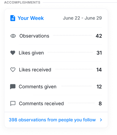
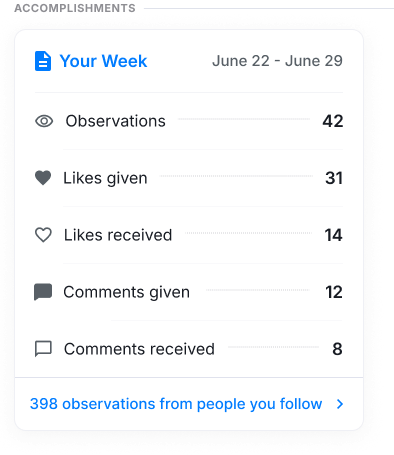
Engineering’s table retained information my grid missed. I recommended the stronger structure and clarified its labels instead of defending the first mockup.
Decision notes and evidence
Alternatives and constraints
- Alternatives
- Keep the smaller grid and add its missing measures, or adopt the table already developed by engineering. I recommended the table.
- Constraints and tradeoffs
- The revised rows distinguish likes and comments given from those received. I also proposed a link into activity from people the user followed. Product deferred that addition, keeping the immediate change focused on the existing information.
Evidence behind this account
The August review and product replies document the table decision, label work, and deferred link. The displayed design retains that historical link, so it is not presented as an exact release screenshot.
04 / Content decision
Let people interpret the comparison.
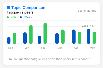
A lower mention count is not automatically better. I advocated neutral labels and asked what the comparison group and each number actually represented.
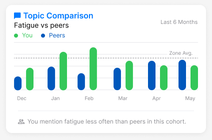
A comparison should explain what differs without implying that a person has performed badly. I questioned the labels and comparison context so the feedback could be interpreted fairly.
Decision notes and evidence
Alternatives and constraints
- Alternatives
- I explored Simple 7 against a zone or peer baseline, topic frequency against peers, and broader percentile comparisons. I also asked whether comparisons should sit in one compact section or inside the relevant cards.
- Constraints and tradeoffs
- I was aiming for neutral feedback that left the final judgment with the person. Product feedback also emphasized recognizing positive performance and comparing people at similar milestones. Those aims raised different questions about which metrics to show, who the comparison group was, and how much explanation the interface needed.
Evidence behind this account
The original sources support the alternatives and the discussion. They do not establish one final comparison policy or show that users interpreted the displayed samples correctly.
WHERE IT LANDED
A first release shaped through design and engineering.
I took the work from broad page concepts through detailed flows and implementation review. The team reported About Me live on web and server on September 2, followed by both mobile apps on September 3, 2026. My contribution was making the choices concrete: what to reuse, what to clarify, and what to leave for later.
What I learned and would test next
A polished chart can hide an unresolved product question. Defining the comparison, its source, and how people should interpret it belongs in the design work from the start.
I would ask people to explain a comparison in their own words, find what it is based on, and describe a useful next action.
Original portfolio and Figma design artifacts with sample content. Engineering reported web/server release September 2 and mobile release September 3, 2026. Exact pictured variants and user impact were not independently verified.
KEEP EXPLORING