
 Selected work
Oak AI / HEURISTIC EVALUATION · PRIORITIZATION
Make the usability risk specific enough to fix.
A structured desktop evaluation connected confusing entry points and easy-to-miss feedback to a prioritized product discussion.
9 min read
- The question
- What makes Oak's purpose, starting points, and error recovery difficult to understand?
- The method
- Desktop heuristic evaluation in Chrome on a Mac, recorded November 22, 2023.
- The handoff
- Findings presented December 3, followed by an improvement list and collaborative navigation and UI work.
THE CONTEXT
The team needed a reason to address an issue, not only a screen marked up.
Oak's early desktop experience combined inconsistent labels, competing entry points, and feedback that could be easy to miss. A person trying to begin needed to understand the product's purpose, choose an action, and recognize where that action led. The evaluation made those risks specific enough to discuss.
The product context and constraints
I recorded interface observations beside criteria and ratings in a heuristic worksheet. I then connected the findings to a report and visual recommendations. The purpose was to give the team an inspectable starting point for design work and subsequent testing, not a measured estimate of how often people failed.
The report proposed beginning with information architecture and UX writing, then using later evaluation and user testing to examine the next iteration. That was the documented staging rationale: establish clearer structure and language, while leaving room for direct user evidence to revise the expert judgments.
Constraints that shaped the work
- The inspected worksheet documents a desktop expert review; its mobile sheet has no completed numeric ratings.
- The ratings reflect evaluator judgment, not observed participant failure rates or implementation effort.
- The available record supports prioritization discussion and staged recommendations, but not a finalized, effort-scored backlog or a verified release order.
- Later usability work is separate from the November expert review and does not validate every pictured recommendation.
MY CONTRIBUTION & COLLABORATION
I conducted the heuristic evaluation and UX audit, wrote findings and recommendations, and presented them to the team. I initiated the UX improvement list and worked on navigation labels, sitemap alternatives, UX writing, and ticket clarification. Mockup work was collaborative with the lead UX designer, who led later targeted design refinements.
DECISION 01
Keep each rating attached to an observable interface issue.
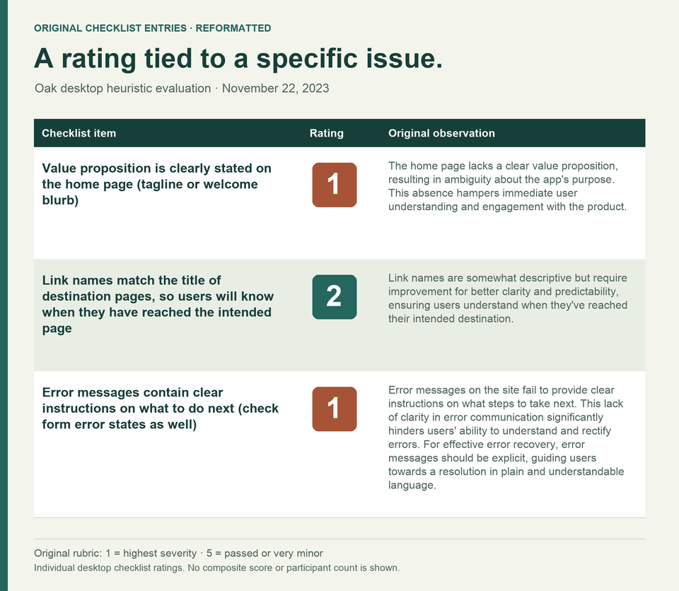
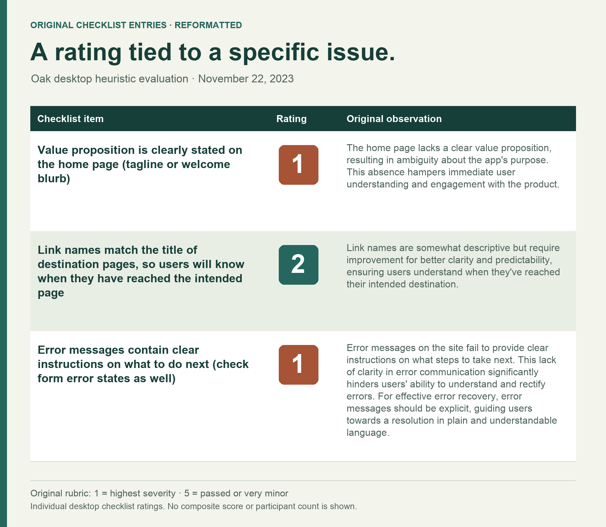
The worksheet connected a criterion, a rating, and a written observation. For example, it distinguished the missing value proposition from mismatched destination labels and unclear error instructions. That kept the discussion grounded in things the team could inspect.
Selected findings and their original ratings
| Criterion | Original rating | Observed concern |
|---|---|---|
| The home page states the product's value | 1 | The purpose and value proposition were not clear on the home page. |
| Link names match destination titles | 2 | Labels needed to better confirm that the person reached the intended page. |
| Error messages explain the next step | 1 | Error feedback did not provide clear recovery instructions. |
These are expert ratings of individual criteria, not participant counts, observed failure frequencies, or a normalized usability score.
Alternatives and constraints
- Alternatives
- A summary score would conceal what needed to change. The individual entries let the team ask whether an observation was valid, what task it affected, and what additional evidence would be useful.
- Constraints and tradeoffs
- Expert review provided an initial account of usability risk. The severity scale supplied an order for discussion, but it did not measure the frequency of the problem, the number of people affected, or the cost of fixing it.
Evidence behind this account
The worksheet records the desktop/browser context and November 22 date. Its rubric runs from 1 at the most severe end to 5 for passed or very minor. Individual findings are usable; a composite score is not part of this case.
DECISION 02
Show the task at risk behind the interface detail.
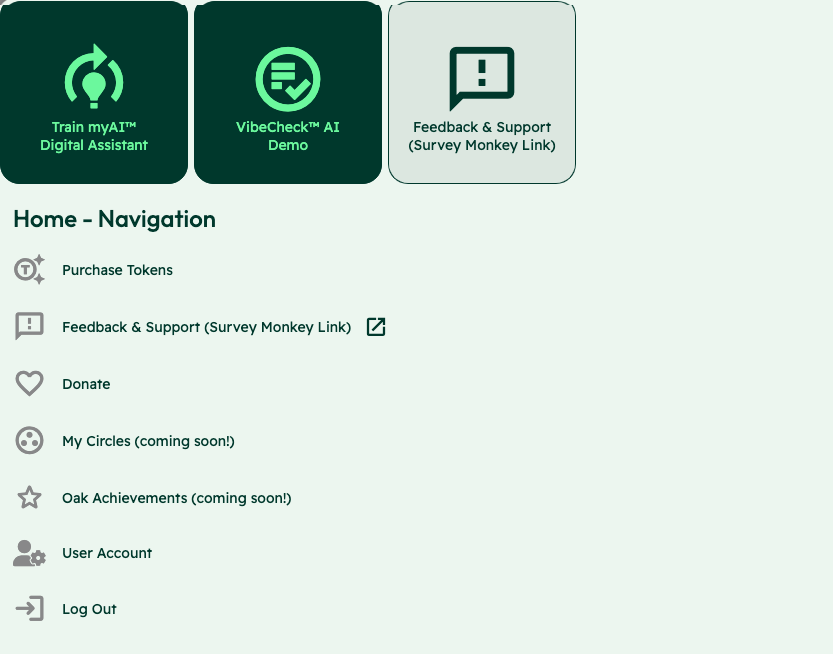
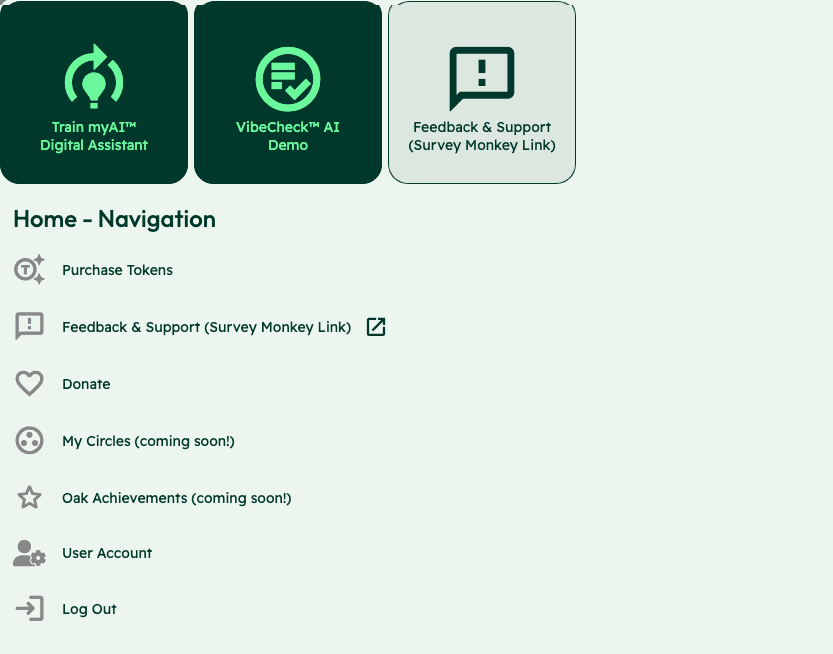
The home screen placed training an assistant, VibeCheck, and support alongside navigation choices. The report also documented a User Account link leading to a page titled User Pages. These details made the navigation risk concrete: both the starting choice and the confirmation of arrival needed to be clear.
From a visible mismatch to a researchable change
| Interface evidence | Task risk | Recommendation to investigate |
|---|---|---|
| Train myAI, VibeCheck, and Feedback & Support appear as competing entry choices. | A new person may not know which action fits what they want to do. | Make primary actions and descriptive labels clearer. |
| User Account links to a page headed User Pages. | The destination may not confirm that the person chose correctly. | Align the label with the destination title. |
| Navigation and logo placement/function vary across screens. | The route back and current location may be harder to recognize. | Use consistent navigation placement and a dependable home route. |
The screenshot shows the entry choices; the User Account/User Pages mismatch is documented separately in the report. These are not participant quotations or measured failure rates.
Alternatives and constraints
- Alternatives
- The recommendations addressed both language and structure: more descriptive labels, clearer primary actions, and consistent placement of navigation and utility elements. In December, I developed two concise sitemaps and compared the advantages and disadvantages of labeling options.
- Constraints and tradeoffs
- Changing a label could improve the immediate signpost while leaving an unclear overall structure in place. A wider information-architecture change would need additional evaluation. The report proposed iterative sitemap work and possible card sorting or A/B testing as future methods, not completed validation.
Evidence behind this account
The original screenshot and report establish the interface details; the contribution log establishes subsequent navigation work. The original sitemap visuals and a comparative test result are not part of the evidence shown here.
DECISION 03
Make the next design conversation specific.
The December 3 contribution record documents presenting the findings, aligning terminology, and beginning an improvement list for later backlog work. The report supplied both problem categories and concrete recommendations, so the team could discuss the reason for a change and what it would involve.
What moved from the evaluation into the handoff
| Work area | Reason in the evidence | Documented next work | Boundary |
|---|---|---|---|
| Navigation and UX writing | The review found unclear purpose, primary actions, labels, and destination confirmation. | The report proposed early IA/UX-writing work; the December log records label comparisons and two sitemap alternatives. | No winning sitemap or comparative task result is established. |
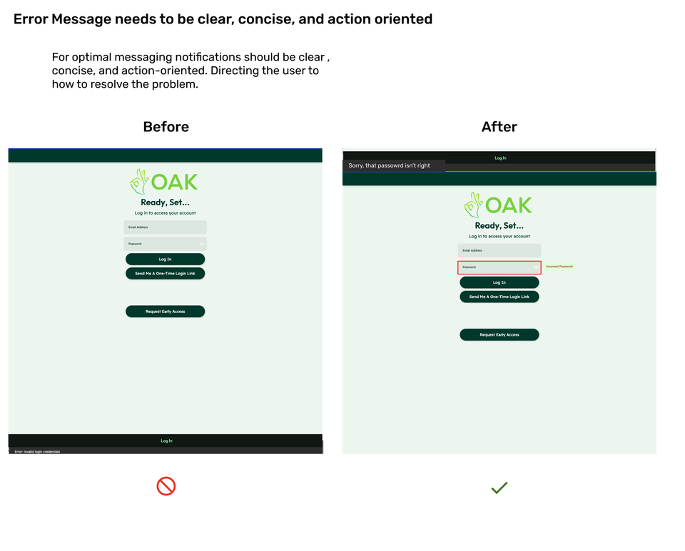
| Form feedback | The existing small error banner did not clearly guide recovery. | The visual recommendation identified the password field with a local error treatment; the log names form/feedback work. | Incorrect Password identifies the problem field but is not complete recovery guidance. |
| Shared UI standards | Branding, navigation placement, and visual treatments varied. | The work included color-role guidance and collaborative header/footer refinement. | This does not establish a complete tested design system. |
The login comparison is an original proposal. Its field label makes the error more specific; fuller recovery copy and successful task completion remained questions to test.
Observed interface
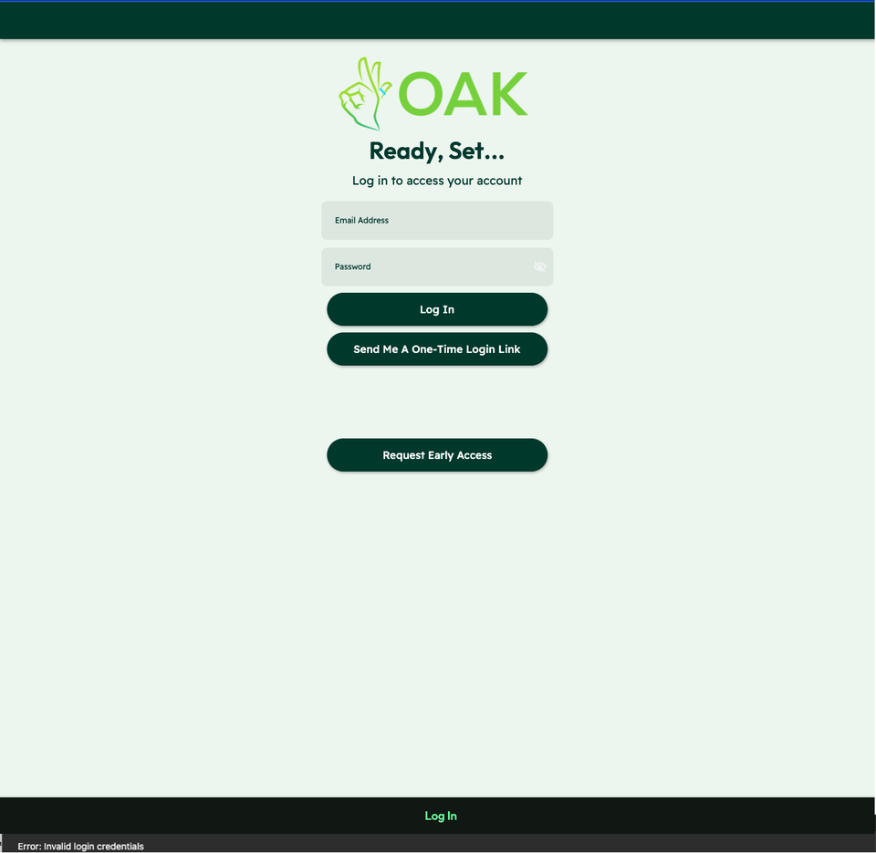
01 / The message at the foot of the page

“Error: Invalid login credentials” appears below the form. It names the failure without connecting it to a field or explaining the next step.
Proposed feedback
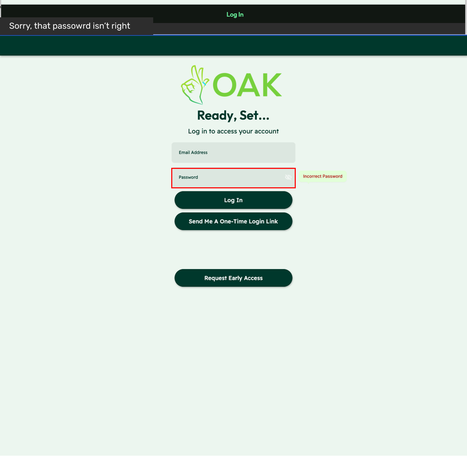
02 / The message beside the password
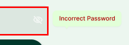
The proposal adds “Incorrect Password” beside the field and shows an alert above the form. The field is identified; fuller recovery guidance remains a next step.
Two crops from the original Oak recommendation, 2023. The right-hand view is proposed feedback.
View the full original recommendation

Alternatives and constraints
- Alternatives
- The handoff connected the review to distinct work areas: navigation clarity, form and feedback behavior, and shared UI standards. It also proposed a staged research path, beginning with information architecture and UX writing before later evaluation and user testing.
- Constraints and tradeoffs
- The evidence supports that staging logic and the subsequent work. It does not show a final ranking based on user reach, effort, or expected return. Severity was a starting judgment for discussion, with direct task testing still needed to confirm or revise the priorities.
Evidence behind this account
The contribution log records the presentation, improvement-list initiation, navigation alternatives, and collaboration on mockups and work tickets. The login artifact shows a proposed field-level error, not a verified reduction in abandonment.
How the work developed
Desktop evaluation
Recorded criteria, ratings, and observations for the Oak web application in Chrome on a Mac.
Findings presented
Presented recommendations, aligned terminology, and initiated a UX improvement list for later backlog work.
Work areas organized
The contribution record names navigation clarity, form/feedback optimization, and UI standards alongside task planning.
Navigation alternatives
Compared labels and developed two concise sitemaps, with clearer calls to action and a shared header/footer direction.
Collaborative design handoff
Helped the lead UX designer refine header/footer mockups and created short documentation and walkthroughs to clarify work tickets.
OUTCOME & REFLECTION
Findings the team could take into the backlog.
I delivered and presented the evaluation and recommendations on December 3, 2023, then helped turn the findings into a UX improvement list for backlog planning. The work gave the team concrete navigation and feedback issues to address in subsequent iterations; later mockup refinements were led by a design collaborator.
Keep the priority open to better evidence.
The report made the issues concrete, but a severity rating was still an expert judgment. In a next pass, I would attach a small task check to each major recommendation and use those observations to revise the order of work. I would also make the error copy more actionable: the proposed password label pointed to the problem without fully explaining the recovery.
The next question I would test
Ask first-time users to explain the product's purpose, choose an entry point, recognize the destination, and recover from a login error. Record where help is needed, then revisit the initial expert priorities with the team.
November 22, 2023 desktop checklist, November design recommendation report, and December 3 contribution record. This was an expert evaluation, not a participant usability test. Recommendations and later implementation are distinct; measured usability improvement is unverified.
KEEP EXPLORING